Case Study: Marklews – Corporate image maintenance for the long term
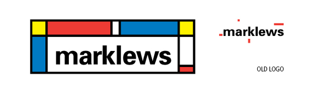
Inspired by a Modern Art Movement, this updated identity is a testament to the inspiration and original vision of the business owners
Situation
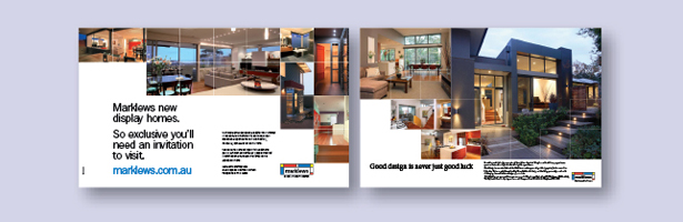
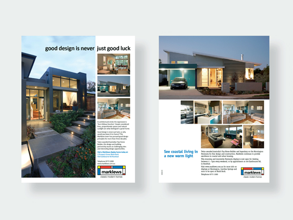
Marklews is one of Melbourne’s most respected boutique builders, known for its innovative, architect-designed homes dotted across the Mornington Peninsula and city suburbs. Coinciding with their 30 year business anniversary, the firm left their leased premises behind and purchased their own offices in Bayside Melbourne.
Having been responsible for designing the existing Marklews identity, we suggested that an update was timely. The objective was to give a fresh, new look to the brand while retaining all the valuable equity built over their 30 year history.
Approach
The update provided an opportunity to re-connect with the original inspiration that drove the owners when the business was first started. One of these factors was the influence of De Stijl, an early C20 Dutch abstract art movement. Well known examples are designer Gerrit Rietveld’s iconic Red and Blue chair and the primary coloured, asymmetric paintings of Piet Mondrian. These shapes and colour palettes inspired the modernistic treatment of the updated corporate identity.
Outcome
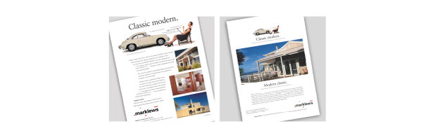
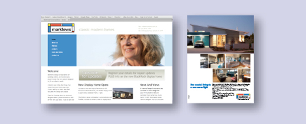
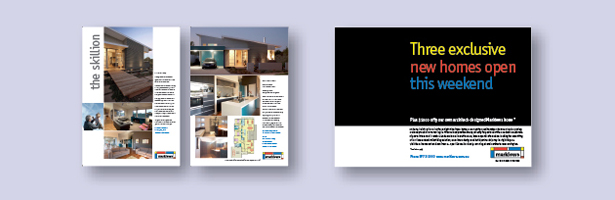
The new aesthetic continued through the collateral and advertising material, anchoring the firm and giving a bright, clean look to its marketing. Marklews new livery speaks powerfully to the needs of prospective clients. It transmits directly what customers get when they use the firm’s services.